Examples
Vertical
Passing isVertical to OverflowMenu will change its behavior to respond to breakpoints based on window height instead of width.
Breakpoint on container width
By passing in the breakpointReference property, the overflow menu's breakpoint will be relative to the width of the reference container rather than the viewport width.
You can change the container width in this example by adjusting the slider. As the container width changes, the overflow menu will change between a horizontal menu and a vertical dropdown despite the viewport width not changing.
Breakpoint on container height
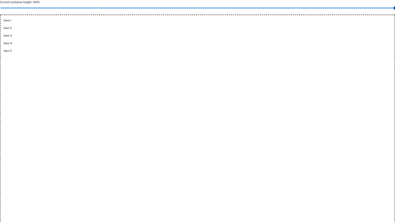
By passing in the breakpointReference and isVertical properties, the overflow menu's breakpoint will be determined relative to the height of the reference container rather than the window height.
Props
OverflowMenu
| Name | Type | Default | Description |
|---|---|---|---|
| breakpointrequired | 'sm' | 'md' | 'lg' | 'xl' | '2xl' | Indicates breakpoint at which to switch between expanded and collapsed states. The "sm" breakpoint does not apply to vertical overflow menus. | |
| breakpointReference | HTMLElement | (() => HTMLElement) | React.RefObject<any> | A container reference to base the specified breakpoint on instead of the viewport width. | |
| children | any | Any elements that can be rendered in the menu | |
| className | string | Additional classes added to the OverflowMenu. | |
| isVertical | boolean | false | Indicates the overflow menu orientation is vertical and should respond to height changes instead of width. |
OverflowMenuContent
| Name | Type | Default | Description |
|---|---|---|---|
| children | any | Any elements that can be rendered in the menu | |
| className | string | Additional classes added to the OverflowMenuContent | |
| isPersistent | boolean | Modifies the overflow menu content visibility |
OverflowMenuControl
| Name | Type | Default | Description |
|---|---|---|---|
| children | any | Any elements that can be rendered in the menu | |
| className | string | Additional classes added to the OverflowMenuControl | |
| hasAdditionalOptions | boolean | Triggers the overflow dropdown to persist at all viewport sizes |
OverflowMenuDropdownItem
| Name | Type | Default | Description |
|---|---|---|---|
| isShared | boolean | false | Indicates when a dropdown item shows and hides the corresponding list item |
| itemId | string | number | Identifies the component in the dropdown onSelect callback |
OverflowMenuGroup
| Name | Type | Default | Description |
|---|---|---|---|
| children | any | Any elements that can be rendered in the menu | |
| className | string | Additional classes added to the OverflowMenuGroup | |
| groupType | 'button' | 'icon' | Indicates a button or icon group | |
| isPersistent | boolean | false | Modifies the overflow menu group visibility |
OverflowMenuItem
| Name | Type | Default | Description |
|---|---|---|---|
| children | any | Any elements that can be rendered in the menu | |
| className | string | Additional classes added to the OverflowMenuItem | |
| isPersistent | boolean | false | Modifies the overflow menu item visibility |
CSS variables
| Expand or collapse column | Selector | Variable | Value | |
|---|---|---|---|---|
| .pf-v6-c-overflow-menu | --pf-v6-c-overflow-menu--ColumnGap | 1rem | ||
| ||||
| .pf-v6-c-overflow-menu | --pf-v6-c-overflow-menu--RowGap | 1rem | ||
| ||||
| .pf-v6-c-overflow-menu | --pf-v6-c-overflow-menu__group--ColumnGap | 1rem | ||
| ||||
| .pf-v6-c-overflow-menu | --pf-v6-c-overflow-menu__group--RowGap | 1rem | ||
| ||||
| .pf-v6-c-overflow-menu | --pf-v6-c-overflow-menu__group--m-button-group--ColumnGap | 0.5rem | ||
| ||||
| .pf-v6-c-overflow-menu | --pf-v6-c-overflow-menu__group--m-button-group--RowGap | 0.5rem | ||
| ||||
| .pf-v6-c-overflow-menu | --pf-v6-c-overflow-menu__group--m-icon-button-group--ColumnGap | 0.25rem | ||
| ||||
| .pf-v6-c-overflow-menu | --pf-v6-c-overflow-menu__group--m-icon-button-group--RowGap | 0.25rem | ||
| ||||

