A theme applies specific visual styles to UI components to create a unique, cohesive, and purposeful look. Our theming architecture leverages our design token system to flexibly support different brand identities, user preferences, and accessibility needs.
Theming architecture
We utilize a tiered theming architecture to consistently manage the appearance of UIs:
- Theme: Defines the foundational brand appearance, including core colors, border radii, iconography, and assets.
- Color scheme: Controls the brightness and palette shifts between light and dark environments.
- Contrast mode: Adjusts the style of surfaces and elements for specific aesthetic or accessibility needs.
Themes
We support 2 pre-built themes in PatternFly. While the visual identity of each theme differs, they share the same underlying interaction patterns and accessibility standards.
Default theme
The Default theme creates the standard, open source PatternFly experience. It is characterized by blue branding and modern, square borders.
Project Felt theme
Named after the material of the iconic Red Hat fedora, Project Felt is designed for products within the Red Hat portfolio, providing closer alignment with the Red Hat Design System (RHDS). It replaces PatternFly blue with Red Hat red as an accent color and introduces pill-shaped borders for buttons, controls, and containers, making product UIs feel recognizably Red Hat.
Project Felt is part of a broader, long-term effort to create a more seamless experience for customers across the full Red Hat journey—from marketing sites and the product marketplace to complex enterprise software—developed in collaboration with RHDS.
Because Project Felt is built on our design token system, you can adopt it without breaking changes. To enable it, add .pf-v6-theme-felt to your application's <html> tag. You can preview it alongside our other theming options on PatternFly.org via the masthead theme switcher.
Custom themes
To branch off of our themes and create your own, you can identify the design tokens you'd like to adjust on our all tokens page and provide new values to use within your application.
When to customize a theme
There are a couple of instances when you might want to adjust an existing PatternFly theme:
- One-off adjustments, like changing a single button color, spacer, or font size, when intentional deviation is needed across your product.
- Application-wide adjustments, like changing all button colors and font sizes to adjust the overall brand identity of your product.
Color schemes
Light mode
Light mode is the standard appearance for most web environments.
Light mode places dark text on light backgrounds, while maintaining a text contrast ratio of at least 4.5:1 and a non-text contrast ratio of at least 3:1. Some users might find light screens easier to read, while others might simply prefer the appearance.

Dark mode
Dark mode adapts color palettes for light-sensitive users or low-light environments. It presents light text on dark backgrounds while maintaining the same accessibility ratios as light mode. Some users might prefer dark mode for aesthetics, while others find it to be easier on the eyes and less straining for those with light sensitivities.
For implementation guidance, refer to the dark theme handbook.

Contrast modes
Contrast modes adjust the surface treatment of UI elements across both color schemes. They are mutually exclusive and can't be applied simultaneously.
Default contrast
Default contrast mode is used in the Default theme and doesn't include special enhancements to increase contrast in UI elements. This mode doesn't need to be enabled and simply refers to the standard color palette used to achieve level AA accessibility, with contrast ratios of 4.5:1 for normal text, 3:1 for large text, and 3:1 for graphics and other UI components.
High contrast
High contrast mode is focused on improving accessibility for users who require more clarity and higher contrast between UI elements. It is available across the Default and Project Felt themes in both light and dark color schemes. When enabled, high contrast mode adjusts the following:
- Raises text contrast to meet a WCAG AAA ratio of 7:1.
- Raises non-text element contrast (interactive elements and boundaries) to 4.5:1.
- Applies global border rules that define clear boundaries in place of shadows and subtle background fills, which can disappear in high contrast environments.
High contrast can be enabled manually by users or triggered automatically by OS- and browser-level accessibility settings such as forced colors mode. System-level preferences (like prefers-reduced-transparency and prefers-contrast) take precedence over PatternFly theme settings, so users who have already configured high contrast in their OS or browser will get a consistent experience without conflict.
Note: PatternFly does not automatically prevent glass mode and high contrast mode from being active simultaneously. If both the glass class and the high contrast class are applied, styles will conflict. Product teams are responsible for ensuring these modes are not applied at the same time.
For implementation guidance, refer to the high contrast handbook.

Glass
Glass mode introduces transparency, blur, and depth to the UI, creating a layered visual effect. It is available in both light and dark color schemes across the Default and Project Felt themes, and can be manually enabled in either.
When glass is enabled, the following changes will apply:
- Transparency, blur, and shadows: Surface-level container backgrounds become semi-transparent and apply blur and shadow adjustments, letting content below subtly show through to create a sense of depth and content hierarchy.
- Background image: A brand-approved background image fills the page body, providing the visual layer that glass containers sit above. Product teams must use approved images and ensure text is never placed outside of a container and directly on top of a background image.
- Component-level glass: Glass automatically applies to the login page, masthead, navigation, and page. It can be manually extended to cards, drawers, hero, and panels.
- Layout variations: A banded masthead (with a solid fill and shadowed border to anchor it above the page) and a floating side navigation (with a solid fill and shadow to visually separate it from glass content) are automatically used in place of their standard counterparts.
Products using glass mode must provide users a clear way to switch to default contrast or high contrast. PatternFly does not automatically disable glass effects based on user preferences, so product teams are responsible for ensuring glass is not active when users have enabled high contrast (whether manually or via OS-level media queries such as prefers-reduced-transparency or prefers-contrast).
For more details, including implementation guidance, refer to the glass mode handbook.
Feature compatibility
The following table outlines the availability and compatibility of PatternFly features across themes.
Feature | Default theme | Project Felt theme |
|---|---|---|
Accent color | Blue | Red |
Interactive element colors | Blue | Blue |
Border radius shape | Square | Pill |
Default contrast mode | Standard | Standard |
Background image | Optional (Manual) | Required (with glass mode) |
Branded icons | Optional (Manual) | Default |
High contrast support | Yes | Yes |
Best practices
To ensure your application is robust, maintainable, and adaptable across different themes, we recommend following these best practices.
- Use default PatternFly components: Whenever possible, use PatternFly components as they are. This ensures you stay up-to-date with our intended design, functionality, and accessibility standards. It also makes upgrades more seamless, decreases development time, and guarantees consistency across applications.
- Use design tokens and variables for customizations: If you must customize a component, use the appropriate method:
- Design tokens: For global changes
- Component variables: For component-specific changes
- Example: To override a primary button’s background color, declare
.pf-v6-c-button { --pf-v6-c-button--m-primary--BackgroundColor: [color token]; }instead of.pf-v6-c-button.pf-m-primary { background-color: [color token]; }.
- Always use tokens to create custom styles: When creating custom components or styles, never use hard-coded values like hex codes or color names (
#ffforwhite). Instead, use the appropriate design token, such asvar(--pf-t--global--background--color--primary--default). Tokens automatically adapt to different themes, while hard-coded values do not. - Prioritize semantic tokens: Always use the most relevant semantic token for your use case to ensure the element's purpose is clear and that it receives the correct styling in any theme. If no semantic token exists, you can fall back to a base token.
- Never use a palette token: Do not use palette tokens (like
--pf-t--color--blue--20) directly in your code, as the value is not guaranteed to be consistent across themes. - Use scalable icons: For icons, use vector images (SVG) or icon fonts instead of raster or bitmap images (PNG, JPEG, GIF, BMP, and so on). This allows you to control their color with CSS
fillandcolorproperties. By assigning a design token to these properties, your icons will automatically change color to match the active theme.- If you must use static images, you might need to hide and show different image files based presence of a theme-specific class (like
.pf-v6-theme-dark).
- If you must use static images, you might need to hide and show different image files based presence of a theme-specific class (like
Theming in Figma
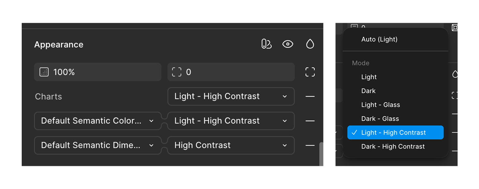
Our Figma libraries fully support theming. The standard light Default theme is applied to components by default. You can swap to any supported combination of theme (Default or Project Felt), color scheme (light or dark), and contrast mode (Default, High Contrast, or Glass) using the Appearance menu in Figma.
Note: Our charts use a unique token collection, so you will need to adjust chart variable modes separately from components. To change the variable mode for charts, follow the same steps outlined for component theme adjustments.
Swapping themes
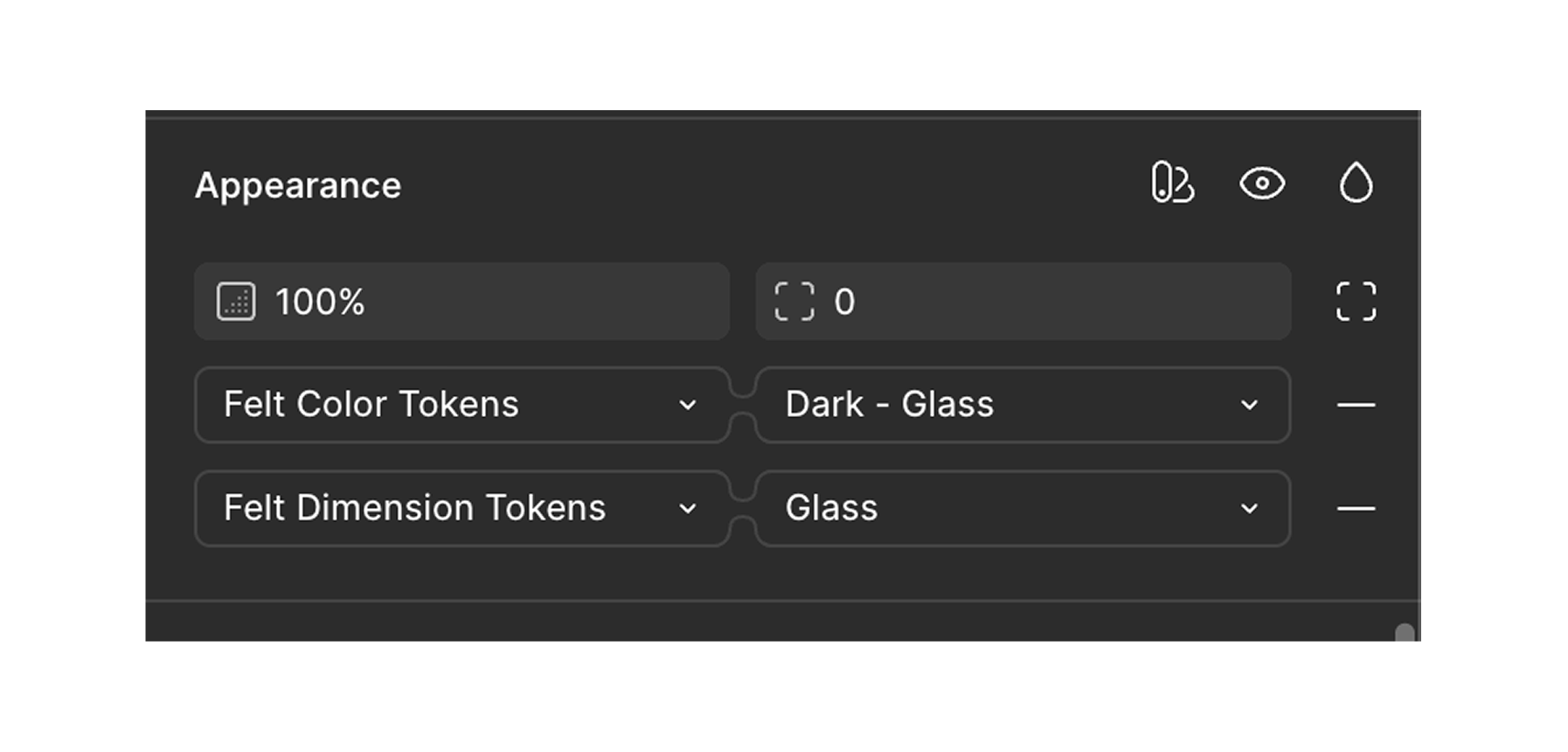
Project Felt's tokens are defined within our Styles & Components Library as an “extended variable collection.” When choosing appearance modes for your Figma designs, you can select between our Default PatternFly theme and the new Project Felt theme via the extended collections dropdown within the Appearance menu. You will need to set “Felt” or “Default” on both the color and dimensions collections.
Swapping color schemes and contrast modes
To swap between our different contrast modes (Default, High Contrast, and Glass), select your desired contrast mode in the second toggle within the Appearance menu. Each contrast mode has a light and dark color scheme defined. You must make sure that the corresponding contrast mode is set across the color token, dimension token, and chart token collections.
Glass style variants
To support glass mode in Figma, we’ve added new “Style” variants across many components. Components that sit directly on top of a background image in glass mode (panel, hero, cards, page, left navigation, and masthead) have a “glass” style variant. Other components that previously had a background by default also now have a “plain” (transparent) style variant, so they can be nested inside a parent component that has glass styles without obscuring the effect.
