Design tokens are the source of truth for our visual design attributes, storing values for concepts like color, typography, and spacing in semantically-named variables. They provide a predictable name and value that conveys their associated style, making their purpose clear and recognizable across all platforms.
Why use design tokens?
A token system enables a shared language for building UIs and helps support better consistency and maintenance across the PatternFly design system.
Consistency
Tokens help maintain consistency across product design processes by ensuring that the same colors and styles are always used for the same use cases. By removing the decision making that would otherwise go into choosing the right color, heading level, spacing, and so on, designs can be created more consistently and efficiently.
Easier maintenance
Tokens also enable easier design system maintenance. Whenever a color is changed as part of a redesign or update, all related tokens are automatically updated to reflect this change. This means that developers won't have to make any code changes to ensure that a product is up to date with the latest PatternFly recommendations. Likewise, designers will see that their Figma designs automatically update to reflect any changes made to tokens.
How do I use design tokens?
To use PatternFly's token system, ensure you have the current version of the library:
- Development: Tokens are available as CSS variables as part of the PatternFly 6 release. Upgrade to PatternFly 6 to implement them.
- Design: Tokens are set up as variables and styles within Figma. Install our Figma library to use them in your designs.
PatternFly 6 components, charts, and extensions are all built with tokens, but you can also view all design tokens here.
Token structure and naming
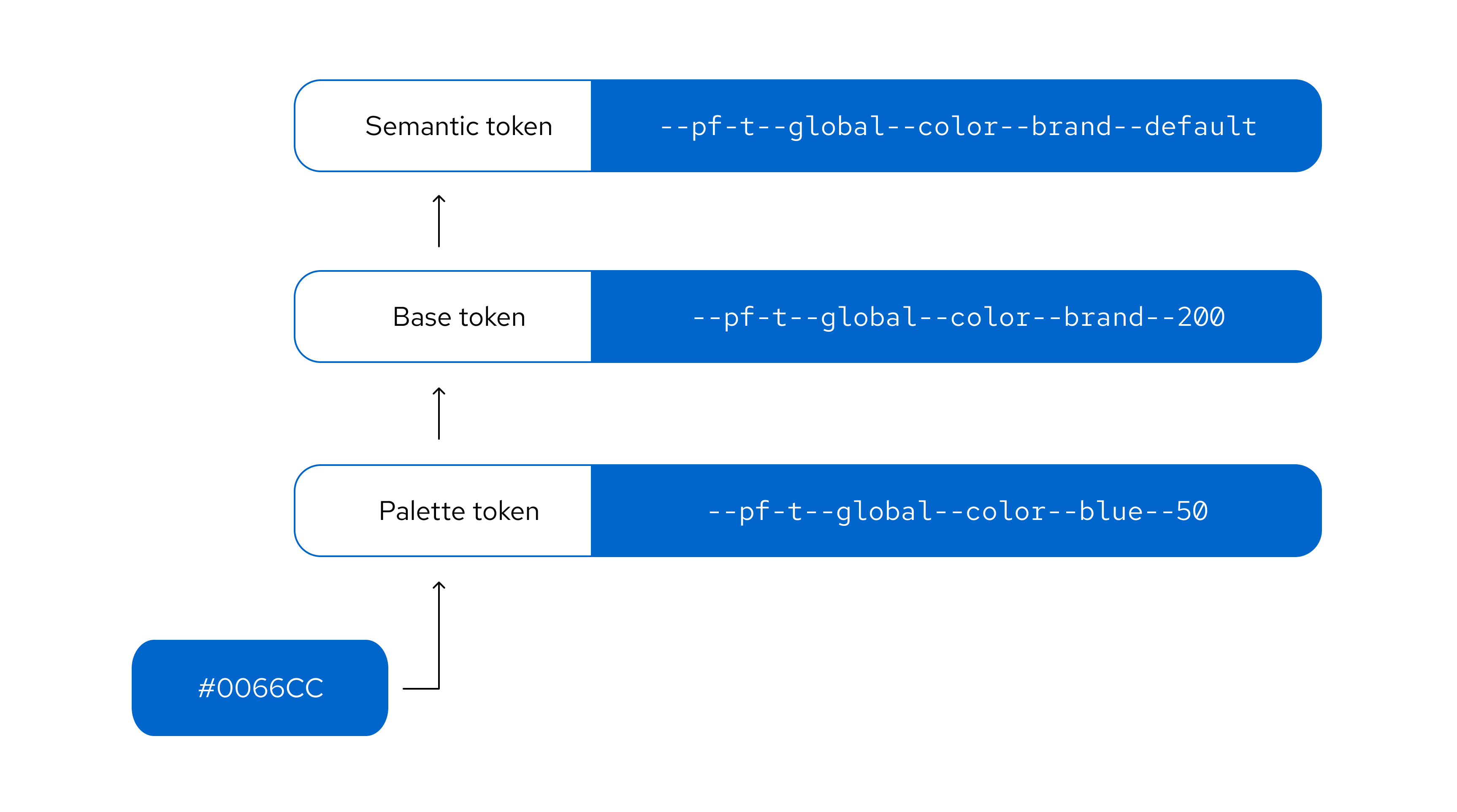
Token layers
The PatternFly token system has 3 distinct layers that build upon each other:
- Palette tokens use PatternFly color palettes to create a color foundation for other token layers to reference.
- Base tokens expand on the palette layer to apply PatternFly colors to concepts. They also introduce additional concepts, like spacing and borders. Base tokens are grouped conceptually and named numerically, with no duplicate values in a concept group.
- Semantic tokens are the top-level tokens that are grouped conceptually and named semantically. They are built with base tokens and are the tokens that you should see and use in most use cases. Semantic naming is intentionally chosen to support the proper and relevant use of a token, which makes design consistency easier for everyone.
Token names
PatternFly token names follow a clear structure, composed of a --pf-t prefix and a series of token segments separated by double hyphens. This structure follows a general-to-specific pattern to ensure context is clear:
--pf-t--[scope]--[component]--[property]--[concept]--[variant]--[state]
Each token segment represents a different type of style information:
Segment | Description |
|---|---|
Scope | The token's range, such as global or chart. |
Component | The component that the token relates to, such as icon, background, or text. |
Property | The style property of a component, such as color, size, width, or radius. |
Concept | The token's higher level concepts, such as status, primary, or action, which have different variant options. |
Variant | The variant of a component or concept, such as link, plain, warning, or success. |
State | The state that the component is in, such as default, hover, or active. |
If a segment isn't relevant for a particular token then it will be skipped in the token's name:
Segments | Example |
|---|---|
[scope]--[component]--[property]--[concept]--[variant]--[state] | --pf-t--global--background--color--action--plain--clicked |
[scope]--[component]--[property]--[variant]--[state] | --pf-t--global--background--color--backdrop--default |
[scope]--[component]--[property]--[variant] | --pf-t--global--border--width--regular |
Theming
Themes are collections of design tokens that reference specific visual values. These values change when a user switches themes, such as truning on dark mode. Using themes enables us to ship one design system while supporting multiple visual languages that meet different audience or brand requirements.
For more guidance, refer to our themeing guidelines.
