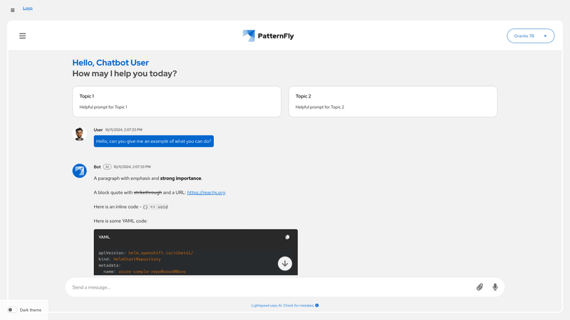
Basic chatbot
This demo displays a basic chatbot, which includes:
- The
<ChatbotToggle>that controls the<Chatbot>container. - A
<ChatbotHeader>with all built sub-components laid out, including a<ChatbotHeaderTitle>that changes its presentation depending on the display mode. - The ability to swap display modes via
<ChatbotHeaderOptionsDropdown> <ChatbotContent>and<MessageBox>with:
- A
<ChatbotWelcomePrompt> - An initial user
<Message>and an initial bot message with message actions. - Logic for enabling auto-scrolling to the most recent message whenever a new message is sent or received using a
scrollToBottomRef
- A
<ChatbotFooter>with a<ChatbotFootNote>and a<MessageBar>that contains the abilities of:
- Speech to text.
- Sending a message to the chatbot.
- Receiving a response from a backend AI tool with a loading message state.
- A
<ChatbotConversationHistoryNav>toggled open and closed by the<ChatbotHeaderMenu> in the<ChatbotHeader>.

Embedded chatbot
This demo displays an embedded chatbot. Embedded chatbots are meant to be placed within a page in your product. This demo includes:
- A PatternFly page with a sidebar and masthead
- A
<Chatbot>container. - A
<ChatbotHeader>with all built sub-components laid out, including a<ChatbotHeaderTitle> <ChatbotContent>and<MessageBox>with:- A
<ChatbotWelcomePrompt> - An initial user
<Message>and an initial bot message with message actions. - Logic for enabling auto-scrolling to the most recent message whenever a new message is sent or received using a
scrollToBottomRef
- A
- A
<ChatbotFooter>with a<ChatbotFootNote>and a<MessageBar>that contains the abilities of:- Speech to text.
- Sending a message to the chatbot.
- Receiving a response from a backend AI tool with a loading message state.
- A
<ChatbotConversationHistoryNav>that can be toggled by the<ChatbotHeaderMenu> in the<ChatbotHeader>.
Props
Chatbot
| Name | Type | Default | Description |
|---|---|---|---|
| childrenrequired | React.ReactNode | Content to be displayed in the chatbot | |
| className | string | Custom classname for the Chatbot component | |
| displayMode | ChatbotDisplayMode | ChatbotDisplayMode.default | Display Mode for the Chatbot |
| isVisible | boolean | true | Visibility flag for the chatbot |
ChatbotToggle
| Name | Type | Default | Description |
|---|---|---|---|
| closedToggleIcon | () => JSX.Element | An image displayed in the chatbot toggle when it is closed | |
| isChatbotVisible | boolean | Flag indicating visibility of the chatbot appended to the toggle | |
| onToggleChatbot | () => void | Callback fired when toggle button is clicked | |
| toggleButtonLabel | string | Accessible label for the toggle button | |
| toolTipLabel | React.ReactNode | Contents of the tooltip applied to the toggle button | |
| tooltipProps | Omit<TooltipProps, 'content'> | Props spread to the PF Tooltip component |
ChatbotContent
| Name | Type | Default | Description |
|---|---|---|---|
| childrenrequired | React.ReactNode | Content to be displayed in the chatbot | |
| className | string | Custom classname for the ChatbotContent component |
ChatbotWelcomePrompt
| Name | Type | Default | Description |
|---|---|---|---|
| descriptionrequired | string | Welcome message | |
| titlerequired | string | Title for the welcome message | |
| className | string | Custom classname for the WelcomePrompt component | |
| prompts | WelcomePrompt[] | Custom basic prompts to help users coming for the first time to chatbot |
ChatbotFooter
| Name | Type | Default | Description |
|---|---|---|---|
| children | React.ReactNode | Children for the Footer that supports MessageBar and FootNote components | |
| className | string | Custom classname for the Footer component |
MessageBar
| Name | Type | Default | Description |
|---|---|---|---|
| onSendMessagerequired | (message: string) => void | Callback to get the value of input message by user | |
| alwayShowSendButton | boolean | Flag to always to show the send button. By default send button is shown when there is a message in the input field | |
| attachMenuProps | MessageBarWithAttachMenuProps | Props to enable a menu that opens when the Attach button is clicked, instead of the attachment window | |
| className | string | Class Name for the MessageBar component | |
| handleAttach | (data: File[], event: DropEvent) => void | Callback function for when attach button is used to upload a file | |
| hasAttachButton | boolean | true | Flag to disable/enable the Attach button |
| hasMicrophoneButton | boolean | Flag to enable the Microphone button | |
| isSendButtonDisabled | boolean | Flag to provide manual control over whether send button is disabled |
ChatbotFootnote
| Name | Type | Default | Description |
|---|---|---|---|
| labelrequired | string | Label to show for the footnote | |
| className | string | Custom classname for the Footnote component | |
| popover | ChatbotFootnotePopover | Config for the popover which opens up when footnote is clicked |
MessageBox
| Name | Type | Default | Description |
|---|---|---|---|
| childrenrequired | React.ReactNode | Content to be displayed in the message box | |
| announcement | string | Content that can be announced, such as a new message, for screen readers | |
| ariaLabel | string | 'Scrollable message log' | Custom aria-label for scrollable portion of message box |
| className | string | Custom classname for the MessageBox component |
Message
| Name | Type | Default | Description |
|---|---|---|---|
| contentrequired | string | Message content | |
| rolerequired | 'user' | 'bot' | Role of the user sending the message | |
| actions | { positive?: ActionProps; negative?: ActionProps; copy?: ActionProps; share?: ActionProps; listen?: ActionProps; } | Props for message actions, such as feedback (positive or negative), copy button, share, and listen | |
| attachmentId | string | Unique identifier of file attached to the message | |
| attachmentName | string | Name of file attached to the message | |
| avatar | string | Avatar src for the user | |
| id | string | Unique id for message | |
| isLoading | boolean | Set this to true if message is being loaded | |
| name | string | Name of the user | |
| onAttachmentClick | () => void | Callback for when attachment label is clicked | |
| onAttachmentClose | (attachmentId: string) => void | Callback for when attachment label is closed | |
| sources | SourcesCardProps | ||
| timestamp | string | Timestamp for the message |
MessageBarWithAttachMenuProps
| Name | Type | Default | Description |
|---|---|---|---|
| attachMenuItemsrequired | React.ReactNode | Items in menu | |
| isAttachMenuOpenrequired | boolean | Flag to enable whether attach menu is open | |
| onAttachMenuInputChangerequired | (value: string) => void | A callback for when the input value in the menu changes. | |
| onAttachMenuToggleClickrequired | () => void | A callback for when the attachment menu toggle is clicked | |
| setIsAttachMenuOpenrequired | (isOpen: boolean) => void | Callback to close attach menu | |
| attachMenuInputPlaceholder | string | Placeholder for search input | |
| onAttachMenuOnOpenChangeKeys | string[] | Keys that trigger onOpenChange, defaults to tab and escape. It is highly recommended to include Escape in the array, while Tab may be omitted if the menu contains non-menu items that are focusable. | |
| onAttachMenuOpenChange | (isOpen: boolean) => void | Callback to change the open state of the menu. Triggered by clicking outside of the menu. | |
| onAttachMenuSelect | (event?: React.MouseEvent<Element, MouseEvent>, value?: string | number) => void | Function callback called when user selects item in menu. |