Usage
PatternFly offers 5 different banner types detailed below. We suggest that users adopt one of these 5 colors, as they’ve been tested with their text colors for accessibility. However, if colors outside of these variations are used, we encourage manually checking color contrast to ensure the banner text is accessible. The text can be positioned on the left, middle, and/or right of the banner.

A default banner should only be used when the banner color does not represent status or severity. When a banner is used to convey status, it is advised to add an icon that also conveys status visually.
Type | Background color | Text color | Status/severity usage |
|---|---|---|---|
Default | --pf-v6-global--BackgroundColor--dark-400 | White | Generic messages |
Blue | --pf-v6-global--info-color--100 | Black | General information messages |
Red | --pf-v6-global--danger-color--100 | White | High severity/danger messages |
Green | --pf-v6-global--success-color--100 | White | Positive/success messages |
Gold | --pf-v6-global--warning-color--100 | Black | Medium severity/warning messages |
When to use
Banners are flexible and can be used for any content and for several use cases outlined in the following examples.
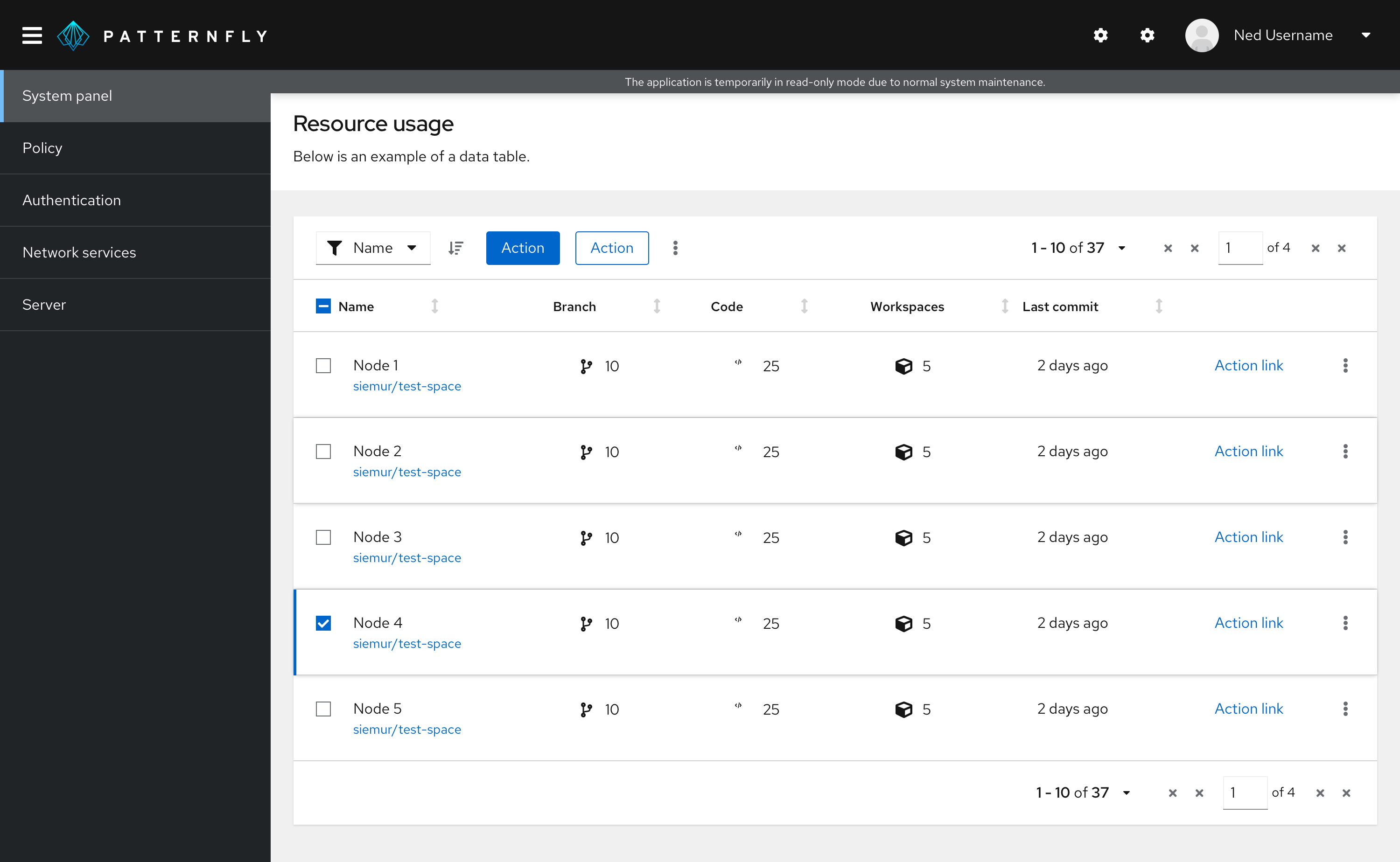
To indicate that an application/site is offline. In this example, a banner is used to indicate to the user that the site is undergoing maintenance and that they will have limited functionality as a result. The banner is shown at the top to ensure that the user does not miss this disclaimer. Since this is a general, non-severe message, a default banner was used.
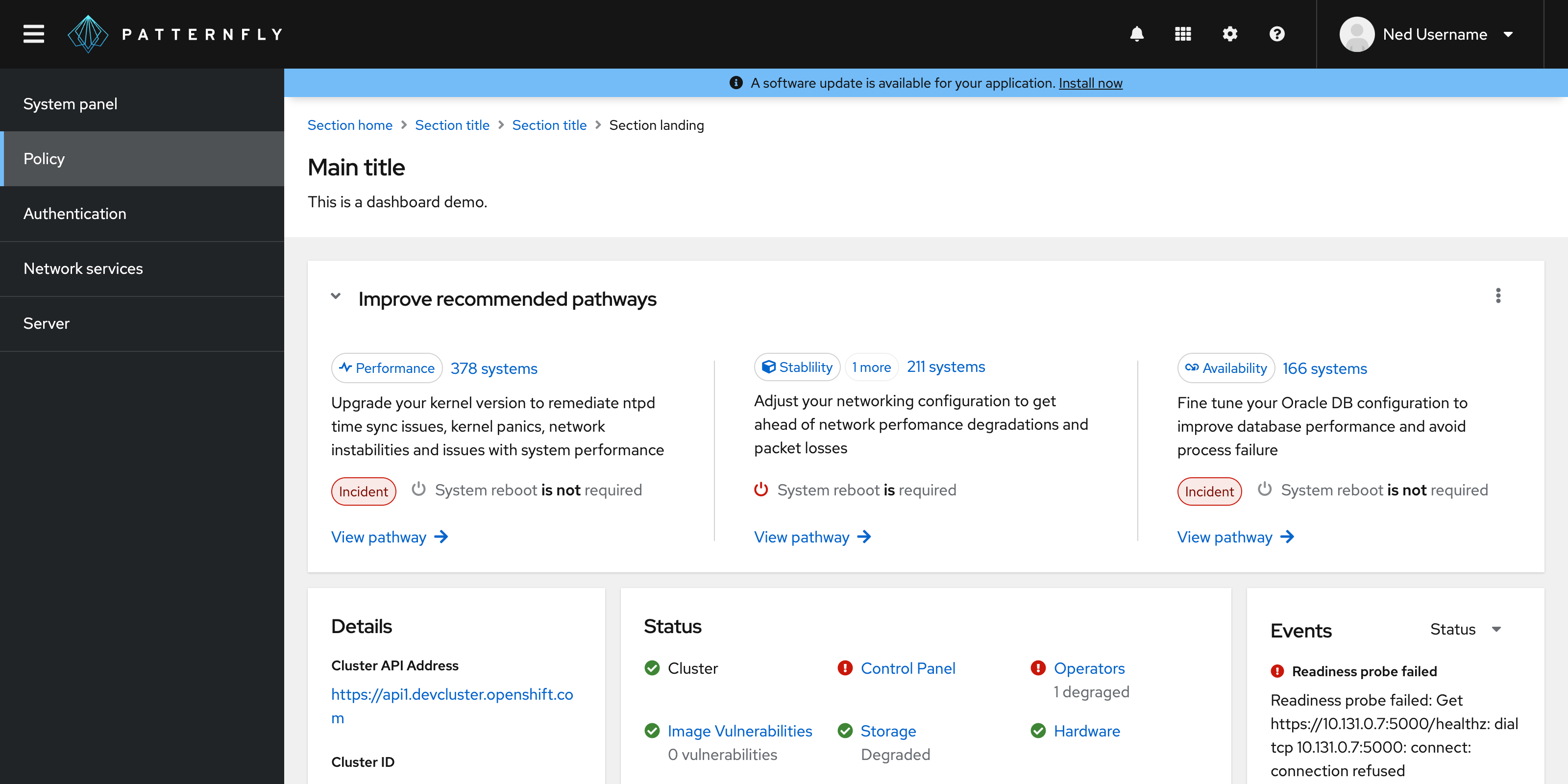
To indicate that an application upgrade is available. In this example, the user is notified of an available upgrade through a banner at the top of the page. Since the use case here is to convey information, a blue status banner was used.
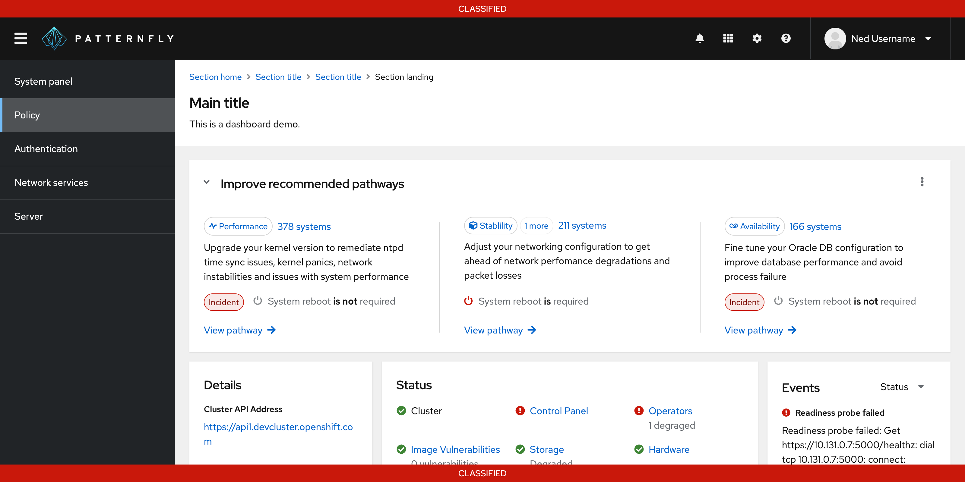
Government system classification banner. In this example, a banner is used to display classification level on a webpage. When an information system is deployed into the U.S. Government, it must be approved of what type of data to process, such as data classification. This classification banner communicates what types of data users are working with. Since this information is considered highly important, a red banner was used.
When not to use
Do not use banners:
For use cases requiring more than a single line of content. Use an inline alert instead.
For use cases requiring important actions for the user to take. Use a hint instead.
Variations
Banners with icons
Banner with icons can be used for added emphasis. Use icon banners when indicating status to make the banner more accessible.

Spacing
Padding
The padding required above and below a banner will depend on where it is placed.
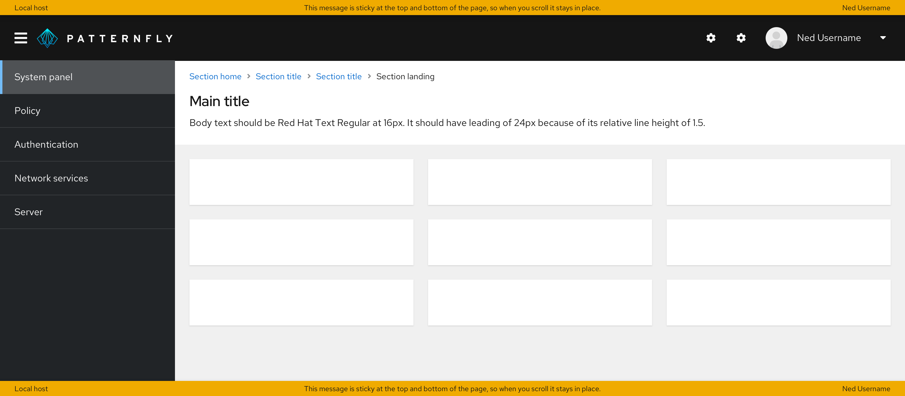
When placed above or below the page, the padding above and below should be 0px, as the banner should touch the top and/or bottom of the page.
When placed above the main content area, there should be no padding above the banner, and in most cases there should be 24px padding below it. The only exception is when breadcrumbs are directly below the banner — in that case, the padding should be 16px below the banner.

When placed below the main content area, there should be 24px padding above the banner and no padding below it.
Placement
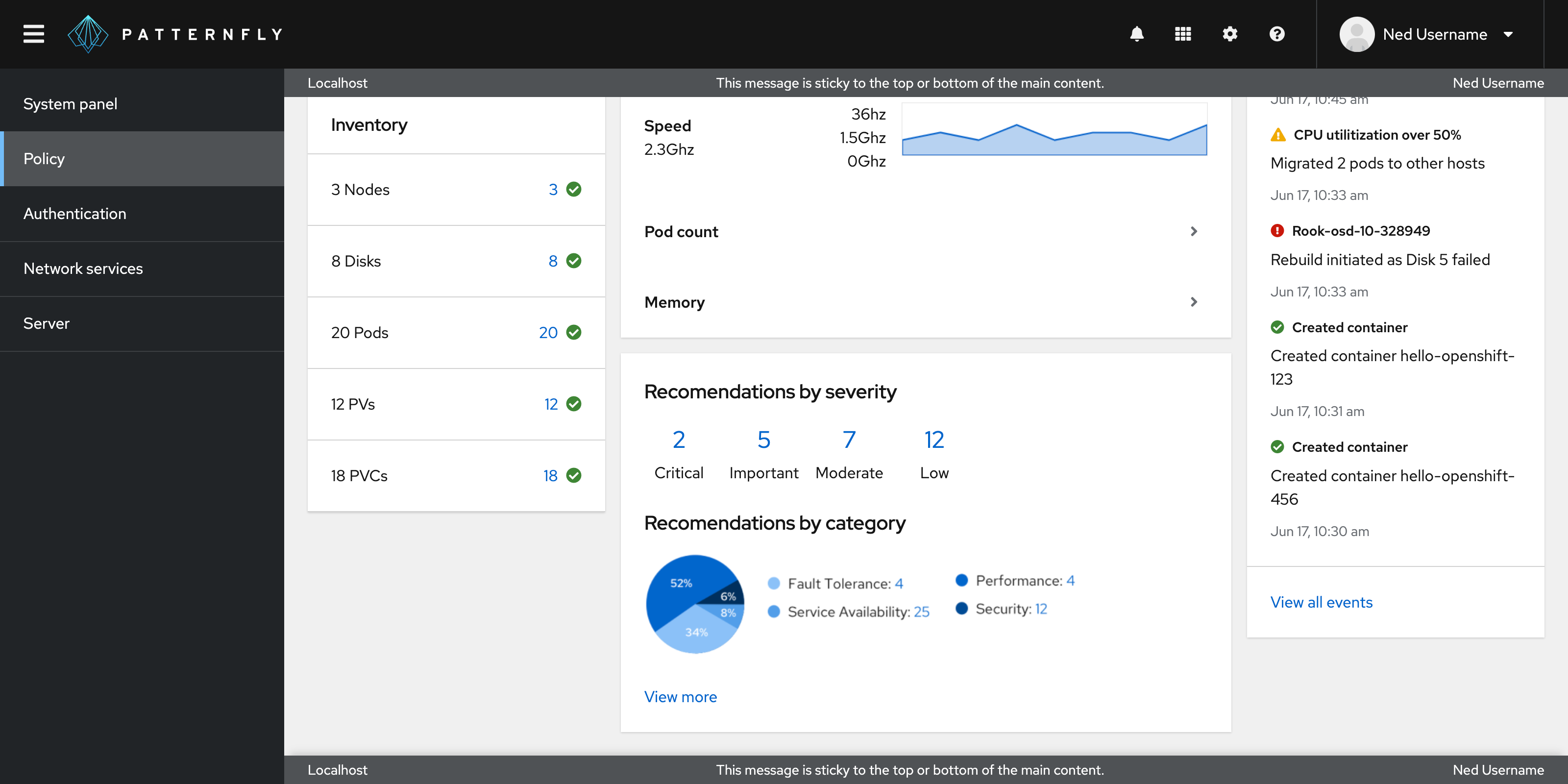
All banners should be a solid bar spanning the width of either the full page or the main content area of the page and should be sticky to where it is used.
The banner should span the top and bottom when it is used for a full page.

The banner should span only the top when it is used for the main content area of the page.

Accessibility
For information regarding accessibility, visit the banner accessibility tab.
