Examples
Documentation
Accessibility
Attribute | Applied to | Outcome |
|---|---|---|
aria-expanded="true" | .pf-v6-c-wizard__toggle | Indicates that the steps menu is visible. Required |
aria-expanded="false" | .pf-v6-c-wizard__toggle | Indicates that the steps menu is hidden. Required |
aria-label="close" | .pf-v6-c-wizard__toggle-icon | Gives the close button an accessible name. Required |
aria-hidden="true" | .pf-v6-c-wizard__toggle-icon, .pf-v6-c-wizard__toggle-divider | Hides the icon from assistive technologies. Required |
aria-label="Steps" | .pf-v6-c-wizard__nav | Gives the steps nav element an accessible name. Required |
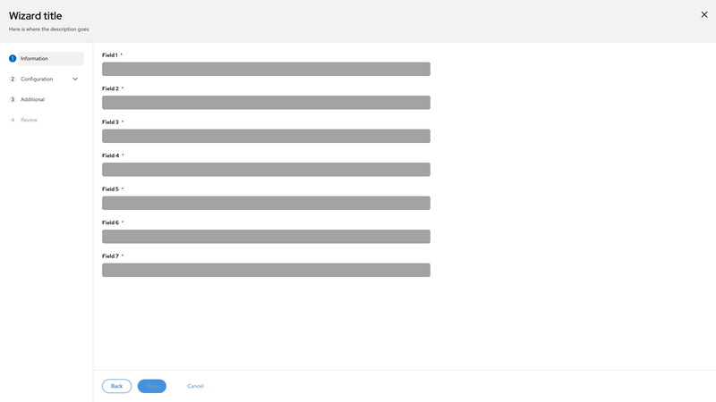
disabled | button.pf-v6-c-wizard__nav-link | Indicates that the element is disabled. Required when a nav item is disabled |
aria-disabled="true" | a.pf-v6-c-wizard__nav-link | Indicates that the element is disabled. Required for disabled links with .pf-m-disabled |
aria-current="page" | .pf-v6-c-wizard__nav-link | Indicates the current page link. Can only occur once on page. Required for the current link |
aria-expanded="true" | .pf-v6-c-wizard__nav-link | Indicates that the link subnav is visible. Required |
aria-expanded="false" | .pf-v6-c-wizard__nav-link | Indicates that the link subnav is hidden. Required |
tabindex="-1" | a.pf-v6-c-wizard__nav-link | Removes a link from keyboard focus. Required for disabled links with .pf-m-disabled |
tabindex="0" | .pf-v6-c-wizard__main | If the wizard main section has overflow content that triggers a scrollbar, to ensure that the content is keyboard accessible, the section must include either a focusable element within the scrollable region or the section itself must be focusable by adding tabindex="0". |
Usage
Class | Applied to | Outcome |
|---|---|---|
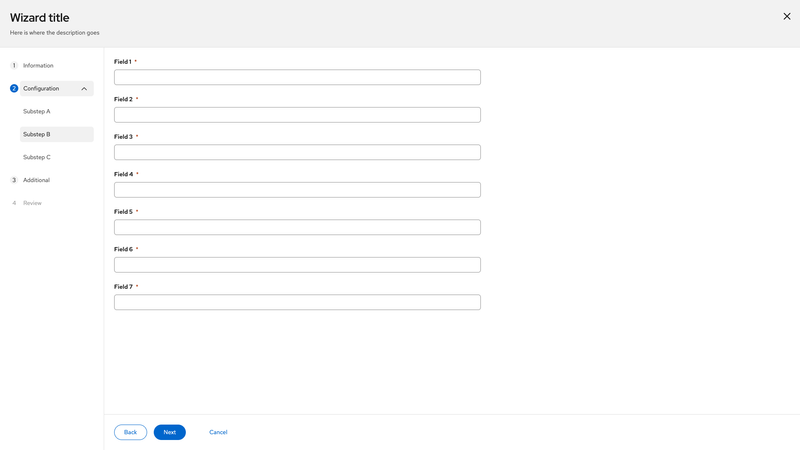
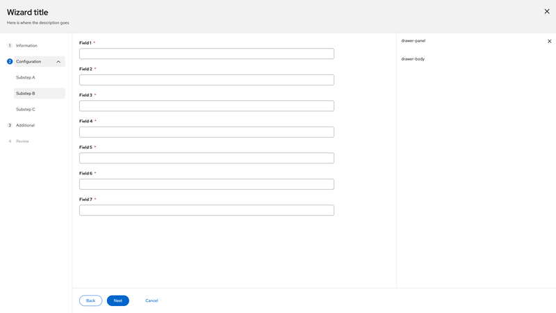
.pf-v6-c-wizard | <div> | Initiates the wizard component. Required |
.pf-v6-c-wizard__header | <header> | Initiates the header. Required when the wizard is in a modal. Not recommended to use when the wizard is placed on a page. |
.pf-v6-c-wizard__close | <div> | Initiates the close button. Required |
.pf-v6-c-wizard__title | <div> | Initiates the title container. Required |
.pf-v6-c-wizard__title-text | <h1>, <h2>, <h3>, <h4>, <h5>, <h6>, <div> | Initiates the wizard title text. |
.pf-v6-c-wizard__description | <div>, <p> | Initiates the description. |
.pf-v6-c-wizard__toggle | <button> | Initiates the mobile steps menu toggle button. Required |
.pf-v6-c-wizard__toggle-list | <span> | Initiates the toggle list. Required |
.pf-v6-c-wizard__toggle-list-item | <span> | Initiates a toggle list item. Required |
.pf-v6-c-wizard__toggle-num | <span> | Initiates the step number. Required |
.pf-v6-c-wizard__toggle-separator | <i> | Initiates the separator between steps. |
.pf-v6-c-wizard__toggle-icon | <span> | Initiates the toggle icon wrapper. Required |
.pf-v6-c-wizard__outer-wrap | <div> | Initiates the outer wrapper. Required |
.pf-v6-c-wizard__inner-wrap | <div> | Initiates the inner wrapper. Required |
.pf-v6-c-wizard__nav | <nav> | Initiates the steps nav. Required |
.pf-v6-c-wizard__nav-list | <ol> | Initiates a list of steps. Required |
.pf-v6-c-wizard__nav-item | <li> | Initiates a step list item. Required |
.pf-v6-c-wizard__nav-link | <a>, <button> | Initiates a step link. Required |
.pf-v6-c-wizard__nav-link-main | <span> | Initiates main link container. Required |
.pf-v6-c-wizard__nav-link-text | <span> | Initiates the link text container. Required when nav item is expandable |
.pf-v6-c-wizard__nav-link-status-icon | <span> | Initiates the status icon container. |
.pf-v6-c-wizard__nav-link-toggle | <span> | Initiates the toggle container. Required when nav item is expandable |
.pf-v6-c-wizard__nav-link-toggle-icon | <span> | Initiates the toggle icon container. Required when nav item is expandable |
.pf-v6-c-wizard__main | <main>, <div> | Initiates the main container. Required Note: use the <main> element when when there are no other <main> elements on the page. |
.pf-v6-c-wizard__main-body | <div> | Initiates the main container body section. Required |
.pf-v6-c-wizard__footer | <footer> | Initiates the footer. Required |
.pf-v6-c-wizard__footer-cancel | <div> | Initiates the cancel button. Required |
.pf-m-expanded | .pf-v6-c-wizard__toggle, .pf-v6-c-wizard__nav | Modifies the mobile steps toggle and steps menu for the expanded state. |
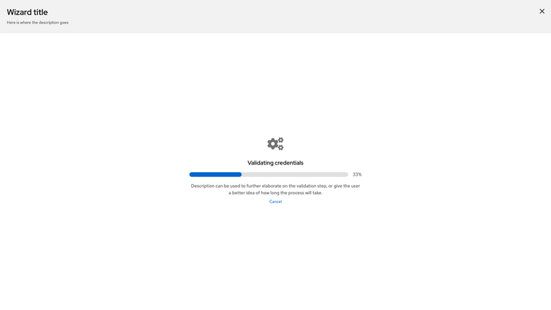
.pf-m-finished | .pf-v6-c-wizard | Modifies the wizard for the finished state. |
.pf-m-plain | .pf-v6-c-wizard | Modifies the wizard to have a transparent background. |
.pf-m-no-plain-on-glass | .pf-v6-c-wizard | Prevents the wizard from automatically applying plain styling when glass theme is enabled. |
.pf-m-expandable | .pf-v6-c-wizard__nav-item | Modifies a nav item for the expandable state. |
.pf-m-expanded | .pf-v6-c-wizard__nav-item | Modifies a nav item for the expanded state. |
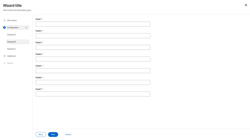
.pf-m-current | .pf-v6-c-wizard__nav-link | Modifies a step link for the current state. Required |
.pf-m-disabled | .pf-v6-c-wizard__nav-link | Modifies a step link for the disabled state. |
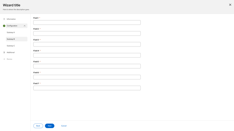
.pf-m-success | .pf-v6-c-wizard__nav-link, .pf-v6-c-wizard__toggle-list-item | Modifies a step link to indicate success status. |
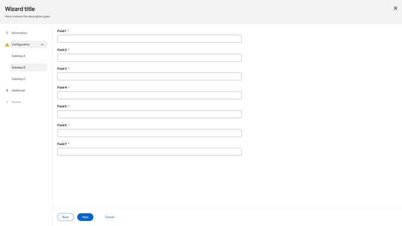
.pf-m-warning | .pf-v6-c-wizard__nav-link, .pf-v6-c-wizard__toggle-list-item | Modifies a step link to indicate warning status. |
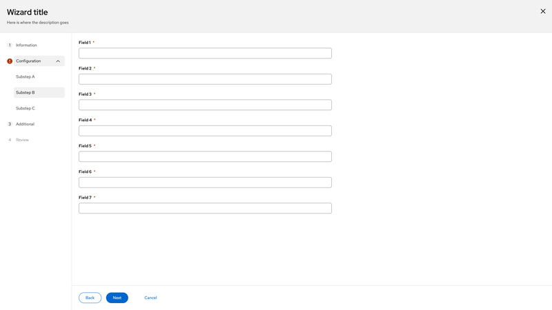
.pf-m-danger | .pf-v6-c-wizard__nav-link, .pf-v6-c-wizard__toggle-list-item | Modifies a step link to indicate danger status. |
.pf-m-no-padding | .pf-v6-c-wizard__main-body | Modifies the main container body to remove the padding. |
