Demos


Cell with image alignment
By default, table cell alignment is set to baseline. This retains vertical alignment with varying text size, but can cause visual inconsistencies with images. The vertical alignment of images within table cells may need to be specified to provide proper alignment.
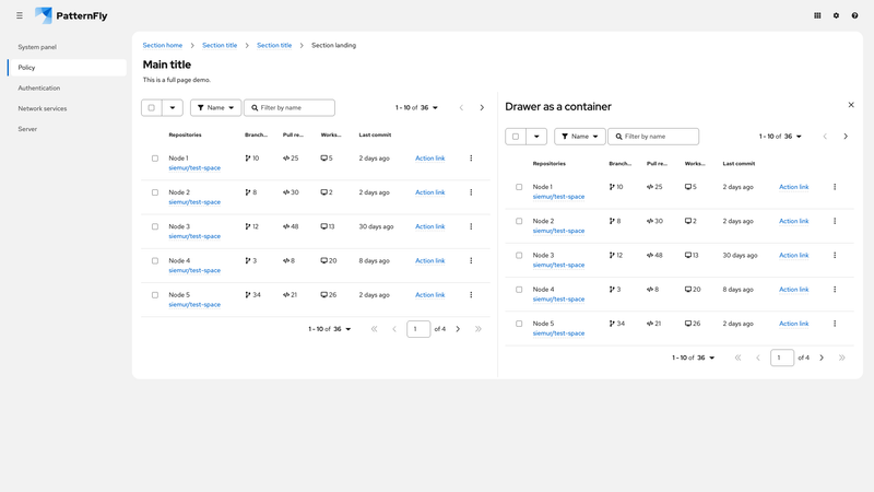
Container query with drawer
This demo shows how tables can use container queries to respond to the size of their container. The drawer panel is defined as a container using container-type: inline-size; container-name: pf-v6-contain-table. This allows the table in the drawer to respond to the panel's width rather than the viewport width.
Because the table in the main content area does not have a specific container around it, its responsive behavior defaults to the container specified on the :root element.
Note that the table in the main content area uses the pf-m-grid-lg modifier and will change between the stacked and grid layout when the viewport reaches the large breakpoint. The table in the drawer uses the medium breakpoint, but changes from stacked to grid layout when its container (the drawer) reaches the medium breakpoint.